The Unusual Design of MHS
If you were to search on Google for “high school,” you will see high schools with big fancy glass entrances, two or more stories, or maybe overall either a big old brick 3 layer building or a modern fancy entrance design 2 layer design building. However, when it comes to MHS, it breaks conventional wisdom of what a normal high school should look like.
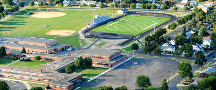
Constructed in the 40s and 50s, this brick and mortar complex has a rather unique design; a satellite view of the building instantly shows a glaring detail. The school is shaped like a square with its inside cropped out or as I like to call it the “Square Donut.” Unlike other schools which may have a small courtyard or none at all. MHS has an unusually large one. Another stark difference is the fact that MHS is only a 1-floor school. Manville achieves this due to there being only about 400 students compared to say Somerville High School which has 3 floors and about 3 times the student count with about 1200. So no need for expansion since it’s a small town. With that, the school makes up for its lost height with the ground area as again looking at satellite footage the school has a perimeter of around 2,545 ft and an area of around 147,391 square feet.
Moving away from the exteriors of the school; the interiors are also interesting. Typical schools usually have layers to designate grade level or type of class. MHS does something a little similar by having a designated science hall and areas designated for electives. The school also has overlapping territory with the connected middle school “ABIS ” even though ironically ABIS is taller than MHS and has two floors. The courtyard also dubs as a unique perk to MHS’s environment as the area is used irregularly by both staff and students during lunch/break periods. It also helps students and staff from having to walk across basically the whole building as the paths outside in the courtyard act as convenient shortcuts.
Overall, Manville High School’s design and layout act as a unique and interesting environment for students and faculty alike and its design should be appreciated for not being a generic cookie cutter design for a high school and something unusually unique.
Xin Chào!, My name is Bill and I´m a Vietnamese freshman at MHS. During my spare time, I like to play simulation games and listen to music (specifically...


